
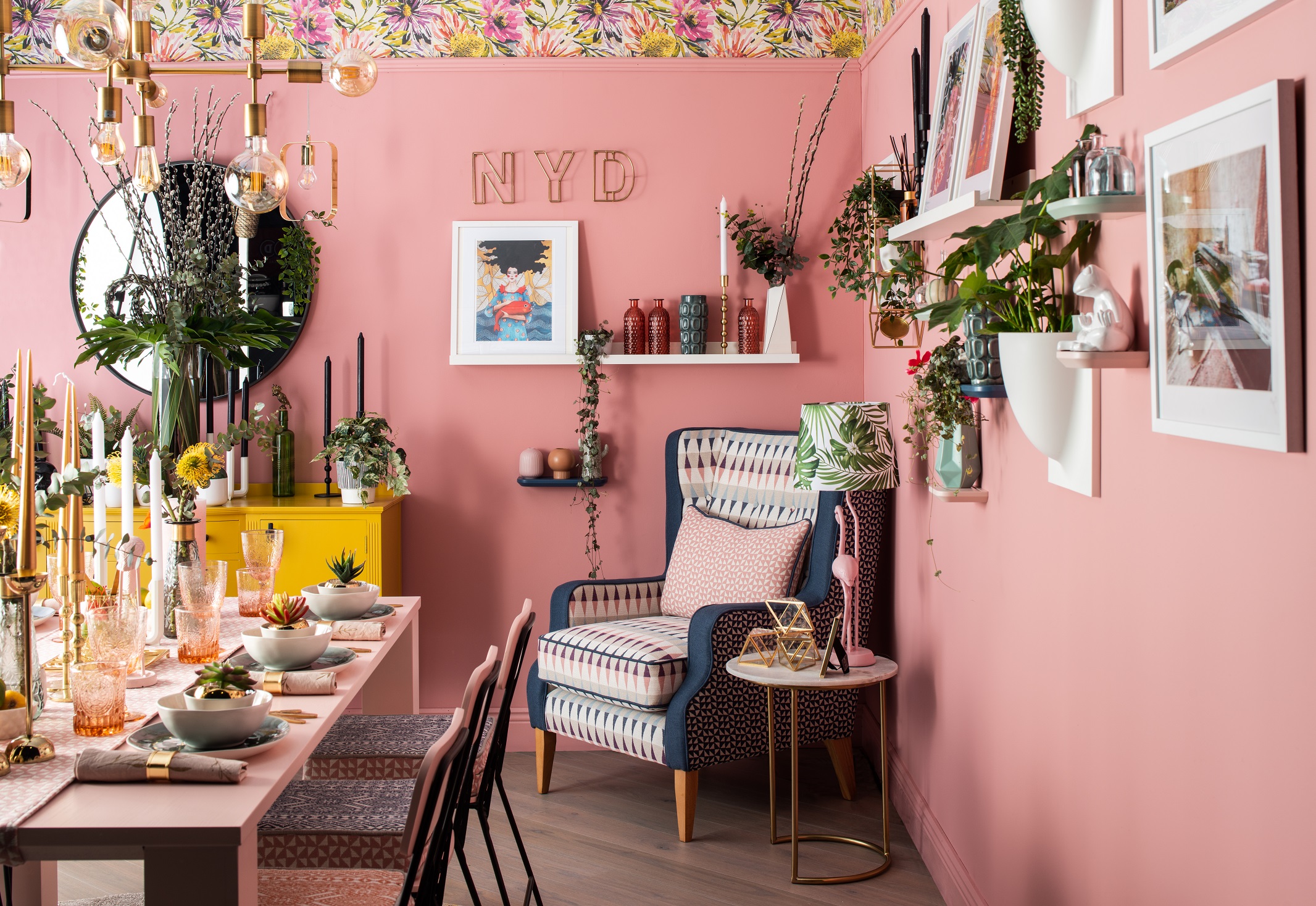
“We just said: ‘Look, let’s be like marmite.’ You’re either going to love it or hate it. We just wanted to do something that was different,” exclaims Chiara Egan of Nine Yards Design. A bold statement, but one that perfectly describes this dining room. With its floral wallpaper, striking, pink dining table and extravagant furnishings – there’s no doubt about it – this dining room certainly makes a statement.
Taking inspiration from the pink and yellow spring tones of her wallpaper, Chiara decided to do something she would never advise her clients to do. “We chose our colour by its name,” she says laughing. “We fell upon Colourtrend’s Blooming Perfect 0062 (available in all Colourtrend stores and stockists) in Ceramic Matt Finish and we just had to use it.”
Whether its gut feeling, a secret intuition, or just sheer luck, the vibrant tones of Blooming Perfect 0062 were, as Chiara described, ‘blooming perfect!’ The vivid hues of the walls certainly demand attention. However, your eye can’t help but gravitate to the upcycled dresser coated in the punchy, vibrant tones and Satin Finish of Colourtrend’s Sin City 0816 (available in all Colourtrend stores and stockists).

Yes, the mustard hues provide a dominant, striking contrast to the pink walls but not in a way that is jarring. On the contrary, it finds a common ground that is both daring yet complementary – as if they are merely a duo of opposites that bring out the best in each other.
“We really wanted to be able to upcycle this piece of furniture and bring in this accent and pop of colour to ensure everything wasn’t pink. If we stuck with just pink tones, we would have ended up with a very monochromatic colour scheme,” Chiara explains. “We always like to look back on our work and say that it has a nice pop of colour. Using Colourtrend’s Sin City 0816 really allowed us to do that.”
It’s difficult to describe this dining room as anything other than a colourful feast. A buffet of small, pink flamingo statues, Aztec printed benches, and stunning gold cutlery and candles. Colourtrend’s Pinkathon 0061 (available in all Colourtrend stores and stockists) in Satin Finish lovingly coats the dining table and chairs, while small trinkets and accessories, such as a white, ceramic frog, hide along the wall. Blink and you might miss it, but have no doubt that you will be back again to feast your eyes on the many delights this room has to offer.
And with such a striking room, it’s unsurprising what Chiara’s favourite interior design trend is at the moment. “I’m really loving that people are using colour again,” Chiara says, in earnest. “People have become a little bit wilder. They’re using a lot of greens, lovely blues and navy tones. We were brave using this pink, and it just shows that people are open to this experience. For a long time, we stayed within our safe zones, but this is no longer happening – and I love it!” – Originally featured on Colour Trend HERE


Do you mind if I quote a few of your articles as long as I provide credit and sources back to your weblog? My blog is in the exact same area of interest as yours and my visitors would truly benefit from some of the information you present here. Please let me know if this okay with you. Appreciate it! Leif Catherman
No problem , thanks
Salutations nineyardsdesign.ie Admin.
I’m Melissa and I recently discovered your website at nineyardsdesign.ie…
I located it after a quick search, so your SEO’s working out…
Information looks decent…
However, one thing’s missing though…
A FAST, SIMPLE way to get in touch with you IMMEDIATELY.
Because research show that a potential customer like me will only hang out a few seconds – 7 out of 10 disappear almost instantly, Click Browse Browse… then gone forever.
I have the answer:
Visitor Engagement Widget is a software widget that’s functions on your site, ready to collect any user’s Name, Email address, and Phone Number. You’ll know instantly they’re interested and you can call them directly to CHAT with them – literally while they’re still on the internet looking at your site.
CLICK HERE https://turboleadgeneration.com to test a Live Demo with Visitor Engagement Widget now to see just how it works and even test it out… it could be massive for your business.
Moreover, now that you’ve got that phone number, with our new SMS Text With Lead feature, you can instantly start a text (SMS) conversation pronto… which is so powerful, because connecting with someone within the first 5 minutes is 100 times more productive than waiting 30 minutes or more later.
The new text messaging feature lets you stay connected consistently with new offers, content links, even just check-in notes to develop a relationship.
Every single thing I’ve just described is extremely easy to implement, cost-effective, and profitable.
CLICK HERE https://turboleadgeneration.com to find out what Visitor Engagement Widget can do for your business, maybe converting up to 100X more eyeballs into leads today!
Melissa
PS: Visitor Engagement Widget offers a FREE 14 days trial – and it even includes International Long Distance Calling.
You have customers waiting to talk with you now… don’t keep them waiting.
CLICK HERE https://turboleadgeneration.com to use Web Visitors Into Leads now.
If you’d choose to unsubscribe click here https://turboleadgeneration.com/unsubscribe.aspx?d=nineyardsdesign.ie
Simply a rapid message – the names and email used in this note, Melissa and Garnsey, are placeholders and not really authentic contact details. We cherish candor and wished to make sure you’re aware of this! Should you wish to communicate with the real individual responsible for this message, do visit our website, and we’ll connect you with the right entity.
Hey would you mind letting me know which hosting company you’re utilizing?
I’ve loaded your blog in 3 different browsers and I must say this blog loads a lot quicker then most.
Can you suggest a good hosting provider at a fair price?
Thanks, I appreciate it!
Here is my web blog – google invisible text
Good web site you have got here.. It’s difficult to find excellent writing like yours these days.
I honestly appreciate people like you! Take care!!
Take a look at my web-site; invisible space copy paste